Menopause Medical
Brand Identity & Style Guide
“Clinical Clarity. Human Warmth.”
Specialist care with
warmth & clarity
Menopause Medical is a specialist menopause clinic founded in Hexham, Northumberland. We combine clinical expertise with genuine empathy to guide women through perimenopause and menopause with confidence.
Clinical Excellence
Evidence-based care from specialist practitioners with deep menopause expertise.
Human Connection
Every patient is heard, respected, and treated as an individual with unique needs.
Clarity & Honesty
Clear, jargon-free communication that empowers informed decisions.
Normalising Menopause
Open, dignified conversation that removes stigma and builds confidence.
Personalised Approach
Tailored treatment plans that reflect each woman’s symptoms, lifestyle, and goals.
Accessible Expertise
Making specialist menopause care available locally, without long NHS wait times.
“Begin your journey to clarity, comfort & confidence.”
Our brand communicates trust and warmth in equal measure. Every touchpoint — from the website to printed forms — should feel reassuringly professional yet genuinely caring.
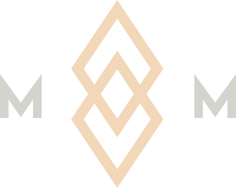
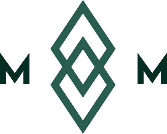
The Menopause
Medical mark
The intertwined diamond symbol represents balance, renewal, and the connection between clinical care and personal wellbeing.
Primary — Dark Green
 Reversed — White
Warm — Champagne
Contrast — Black
Reversed — White
Warm — Champagne
Contrast — Black
Clear Space
Maintain minimum clear space equal to the height of one diamond around the logo at all times.
Minimum Size
Never reproduce the logo smaller than 24px in height for digital or 8mm for print.
Don’t Alter
Never stretch, rotate, recolour, or apply effects to the logo. Use only approved variants.
A palette of
trust & warmth
Deep greens convey medical authority and calm. Champagne tones add warmth, femininity, and approachability. Click any swatch to copy its hex value.
Montserrat.
Clean & modern.
A single typeface family across all touchpoints. Weight and tracking create hierarchy, from delicate hero text to authoritative section labels.
The diamond
pattern
Derived from the logo mark, the diamond pattern adds depth and texture to backgrounds. Use at 5–12% opacity, right-aligned or centred.
The digital
experience
A patient-facing website built with the same principles of clarity and warmth. Fully responsive, accessible to WCAG 2.1 AA, and designed to guide patients from first visit to consultation.
Business
cards
Tactile touchpoints that reinforce the brand in-person. Deep green stock with champagne typography and the diamond pattern at low opacity.
+44 (0) 735 6253 470
www.menopausemedical.co.uk
+44 (0) 735 6253 470
15 St Mary’s Chare, Hexham NE46 1NQ
www.menopausemedical.co.uk
How we
communicate
Professional yet warm. Authoritative yet approachable. Every word should build trust and reduce anxiety.
Do
- Use clear, jargon-free language
- Lead with empathy and understanding
- Be direct and confident in clinical recommendations
- Use active voice and concise sentences
- Refer to patients as individuals
- Normalise the menopause conversation with dignity
Don’t
- Use overly casual, trendy, or slang language
- Make promises about specific outcomes
- Use cold, impersonal, or bureaucratic tone
- Overwhelm with dense medical terminology
- Be patronising or dismissive
- Reduce menopause to stereotypes or clichés
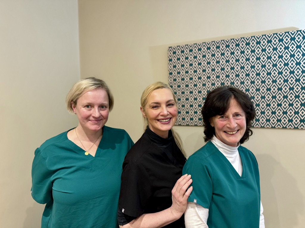
Meet the
team
The faces behind the brand. Specialist practitioners dedicated to improving women’s health and quality of life.
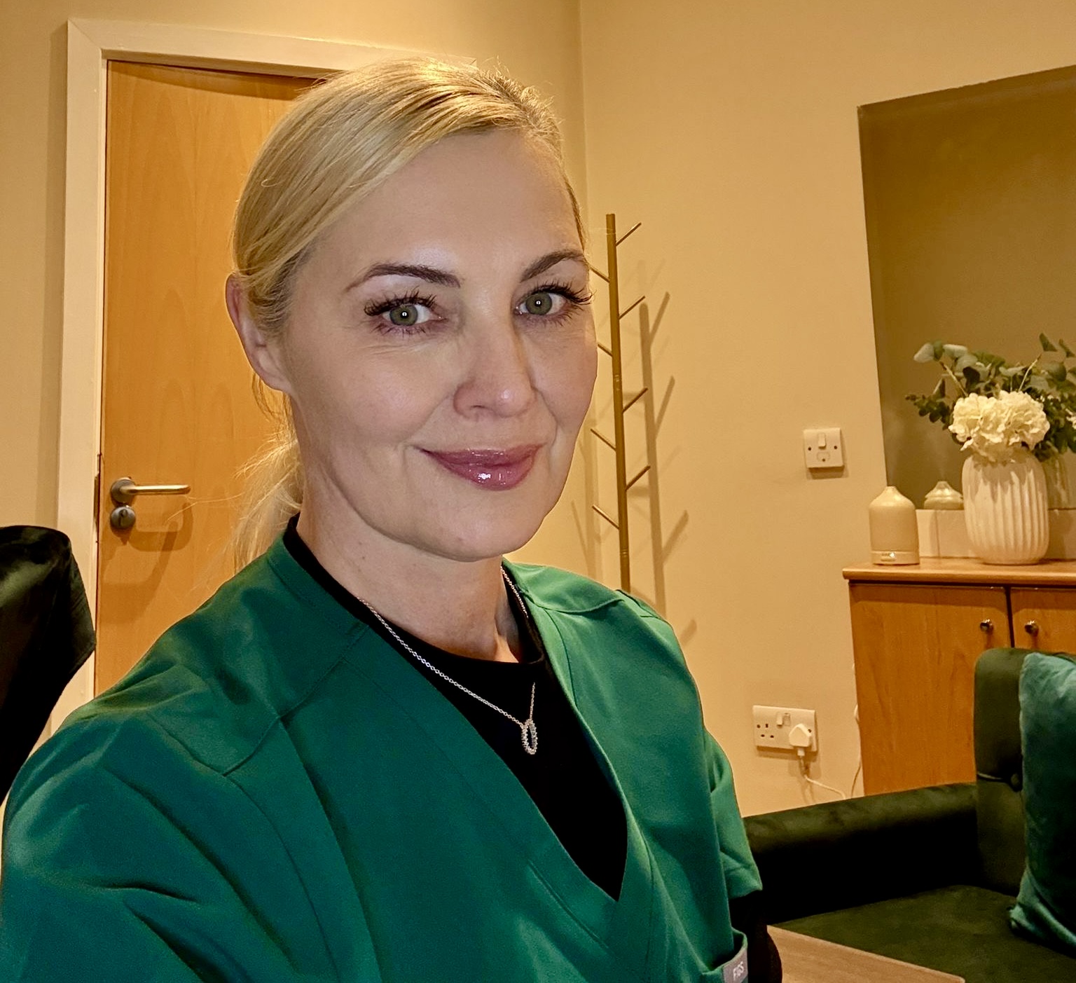
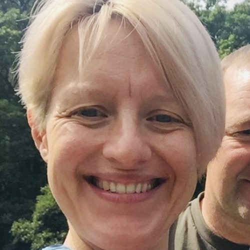
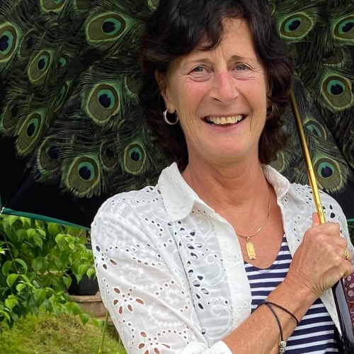

Brand
photography
Warm, natural, and authentic. Photography should feel genuine — real clinic environments, natural light, and candid expressions that build patient trust.
Natural Light
Soft, warm lighting. Avoid harsh flash or clinical fluorescent tones.
Authentic Moments
Candid and natural. Avoid overly posed or stock-style imagery.
Warm Tones
Colour grade towards warm tones that complement the champagne palette.
Digital & print
forms
Three core patient forms available as interactive digital versions, printable A4 layouts, and downloadable Word documents.
Symptom Checker
22-symptom Y/N questionnaire with progress tracking and open-text fields.
Consultation Feedback
9-question Likert scale covering consultation, environment, and clinician quality.
Private Prescription
Full prescriber & patient details, medication items table, declaration, and digital signature.


